+44(0)28 9032 2228


-
 3/3/2025
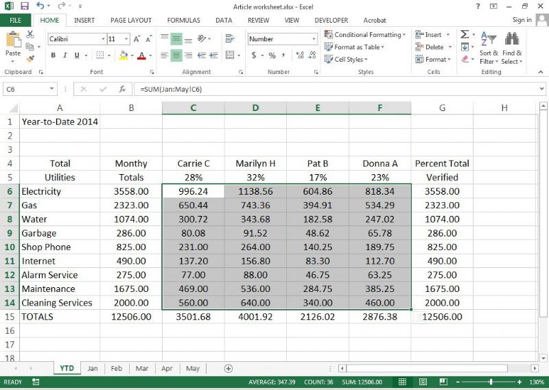
Hot Course - 2 Day Advanced Microsoft Excel Course Training - CALL NOW TO BOOK -
 3/3/2025
IT/Computer Room Hire in Belfast City Centre (Opposite Europa Hotel) - Call now to book -
 14/4/2025
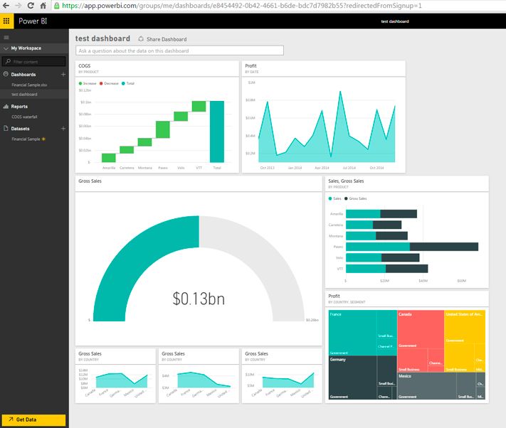
New Course - Microsoft Power BI Introduction training from Belfast Northern Ireland - Classroom & Online Training -
 3/3/2025
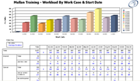
Data Visualisation & Presentation Techniques with Mullan IT Training -
 3/3/2025
Microsoft 365 Training Courses now available inc Belfast, Omagh, Derry, Newry and Throughout Northern Ireland -
 30/4/2025
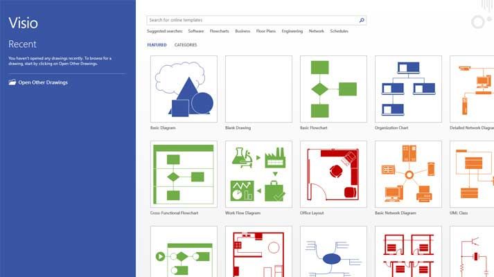
Microsoft Visio Training from Belfast Northern Ireland - Maximise the potential of the Visio application -
 3/3/2025
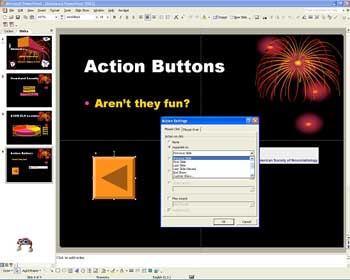
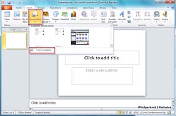
Need to Produce and Deliver Professional Presentations? Book NOW on our Advanced Microsoft PowerPoint course Training in Belfast Northern Ireland OR On your Own Premises - Limited places available -
 14/4/2025
CLASSROOM & ONLINE Power BI Level 1 course -
 26/3/2025
Microsoft Sharepoint Introduction Training Course in Belfast NI -
 3/3/2025
Power BI Paginated Report Builder -
 17/4/2025
HOT COURSE - Introduction to Microsoft Excel Training in Belfast Northern Ireland OR On your Own Premises - Call NOW to Book -
 31/3/2025
Microsoft 365 training courses in Word, Excel, Access, Outlook, Powerpoint, Sharepoint in Belfast and Omagh Northern Ireland -
 3/3/2025
CITB - The Construction Industry Training Board have included Mullan Training on their Approved List We deliver Trainings in Belfast Northern Ireland OR On Customer's Own Premises -
3/3/2025
HOT COURSE - Intro to Microsoft Visio Training in Belfast Northern Ireland OR Virtually - CALL NOW to secure a place on this course -
 20/3/2025
1 day Adv Microsoft Excel CourseTraining in Belfast Northern Ireland OR On your Own Premises - Places Available - Call Now to Book -
 3/3/2025
Intro to Microsoft PowerPoint Training from Belfast Northern Ireland - Online Training Course -
 6/5/2025
Intro to Crystal Reports Training from Belfast Northern Ireland - Virtual, Online - Learn how to create powerful and dynamic reports, presenting your data in an attractive format -
 25/3/2025
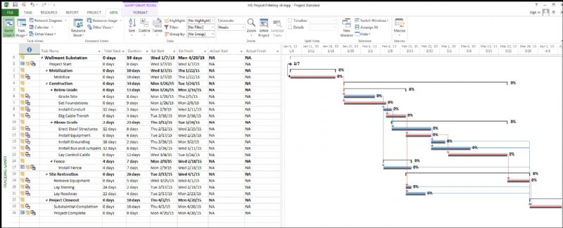
Introduction to Microsoft Project Training from Belfast Northern Ireland - Classroom Based Training & Via Our Online Classrooms
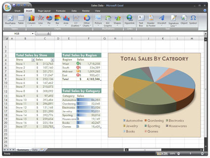
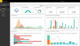
Data Visualisation with Excel & Power BI
Enquire About This CourseWe are currently delivering Online Data Visualisation training via our Virtual Classroom - see our websites for more info:
https://mullanvirtualtraining.co.uk/
https://powerbi-trainingbelfast.co.uk/
PREREQUISITES
- Denote a good working knowledge of Microsoft Excel
- Understand formula/function writing to manipulate data
- Understand basic features of Pivot Tables, such as the area designed for field
SUMMARY
- In this course, you will learn the fundamentals and best practices of data visualisation techniques, as well as hands-on approaches to using Microsoft Excel and PowerPoint to present your data in a variety of formats.
- You will complete multiple exercises and create various types of visualizations and charts throughout the course.
LEARNING OUTCOMES
- Understand basic graphic design principles and how audiences process information visually
- Learn how to make use of emphasis, colour, layout, and typography to maximize the clarity of your messages
- Become familiar with available tools/techniques for data visualization
- Understand the differences between 'Glanceable' and 'Referenceable' visualizations and how to harness the power of each
- Increase the impact and strength of your messages by choosing the most effective chart for a given data set and story in various circumstances
COURSE CONTENT
Data Visualisation Formats
Identify correlations, clusters or patterns and turn them into infographics:
- Different types of charts and graphs (e.g. scatter plots, bubble graphs, pie charts)
- How to easily identify which format to use for which story
- Splitting data between different visualisations

Design Techniques
Understand how to present data in the clearest manner:
- Using colour to add clarity
- Arranging information
- Simple tricks to make your designs look brilliant
Software and online tools
Key steps for maximising different software, including
- Getting your data in order with Excel
- Using Powerpoint and Keynote simply and effectively
- How to use online tools such as Prezi and Datawrapper
Getting creative and telling stories with data
Understand how to apply professional techniques to presentations and reports, including:
- Mining data to find stories
- How different storytelling approaches can be applied to the same data
- How audiences read and interpret visual stories
Click here to download our Course Outline:
Data Visualisation & Presentation Techniques
Enquire About This Course
-
14/4/2025
CLASSROOM & ONLINE Power BI Level 1 course -
3/3/2025
IT/Computer Room Hire in Belfast City Centre (Opposite Europa Hotel) - Call now to book -
3/3/2025
HOT COURSE - Intro to Microsoft Visio Training in Belfast Northern Ireland OR Virtually - CALL NOW to secure a place on this course -
6/5/2025
Intro to Crystal Reports Training from Belfast Northern Ireland - Virtual, Online - Learn how to create powerful and dynamic reports, presenting your data in an attractive format -
31/3/2025
Microsoft 365 training courses in Word, Excel, Access, Outlook, Powerpoint, Sharepoint in Belfast and Omagh Northern Ireland -
3/3/2025
Microsoft 365 Training Courses now available inc Belfast, Omagh, Derry, Newry and Throughout Northern Ireland -
14/4/2025
New Course - Microsoft Power BI Introduction training from Belfast Northern Ireland - Classroom & Online Training -
3/3/2025
CITB - The Construction Industry Training Board have included Mullan Training on their Approved List We deliver Trainings in Belfast Northern Ireland OR On Customer's Own Premises -
3/3/2025
Power BI Paginated Report Builder -
3/3/2025
Need to Produce and Deliver Professional Presentations? Book NOW on our Advanced Microsoft PowerPoint course Training in Belfast Northern Ireland OR On your Own Premises - Limited places available -
3/3/2025
Data Visualisation & Presentation Techniques with Mullan IT Training -
17/4/2025
HOT COURSE - Introduction to Microsoft Excel Training in Belfast Northern Ireland OR On your Own Premises - Call NOW to Book -
3/3/2025
Intro to Microsoft PowerPoint Training from Belfast Northern Ireland - Online Training Course -
3/3/2025
Hot Course - 2 Day Advanced Microsoft Excel Course Training - CALL NOW TO BOOK -
25/3/2025
Introduction to Microsoft Project Training from Belfast Northern Ireland - Classroom Based Training & Via Our Online Classrooms -
26/3/2025
Microsoft Sharepoint Introduction Training Course in Belfast NI -
30/4/2025
Microsoft Visio Training from Belfast Northern Ireland - Maximise the potential of the Visio application -
20/3/2025
1 day Adv Microsoft Excel CourseTraining in Belfast Northern Ireland OR On your Own Premises - Places Available - Call Now to Book